Montserrat Font Guide: Best Uses and Pairings
Explore Montserrat font's optimal applications across branding, web, and print, with expert recommendations for effective pairings to enhance design hierarchy…

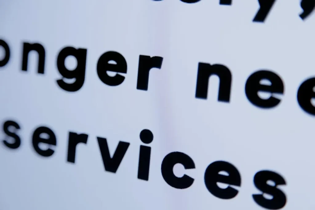
Explore Montserrat font's optimal applications across branding, web, and print, with expert recommendations for effective pairings to enhance design hierarchy…
Selecting the right typeface is a critical decision for any brand, website, or publication, directly influencing readability, aesthetic appeal, and perceived professionalism. Montserrat, a geometric sans-serif typeface, has gained significant traction for its clean lines, open forms, and contemporary feel. This guide explores Montserrat's design characteristics, identifies its most effective applications, and recommends complementary pairings to help designers and marketers leverage its full potential across various media.
Montserrat was designed by Julieta Ulanovsky, inspired by old posters and signs from the traditional Montserrat neighborhood of Buenos Aires. Her goal was to rescue the beauty of urban typography from the first half of the twentieth century. This origin imbues the font with a unique blend of historical charm and modern clarity.
Montserrat's versatility makes it suitable for a wide array of design contexts, from corporate branding to digital interfaces. Its clean aesthetic adapts well to both minimalist and more complex layouts.
Best for: Brands seeking a modern, trustworthy, and approachable identity.
Montserrat’s geometric precision and clarity translate effectively into logos and brand marks. Its multiple weights allow for differentiation between brand names and taglines. The font projects a sense of stability and contemporary professionalism without feeling cold or overly technical. For instance, a bold weight can command attention in a logo, while a lighter weight can provide an elegant contrast for supporting text. This makes Montserrat an excellent choice for designing effective logos and brand marks that convey professionalism and stability.
Best for: Websites, mobile apps, and digital platforms requiring clear, scalable, and accessible typography.
On screens, Montserrat maintains excellent legibility, making it a reliable choice for body text, navigation menus, and call-to-action buttons. Its geometric structure renders sharply across various screen resolutions and pixel densities. The array of weights is particularly useful for establishing visual hierarchy in UI elements, guiding users through content efficiently. Its open letterforms prevent 'mushing' at smaller sizes, crucial for mobile responsiveness.
Best for: Magazines, brochures, reports, and marketing collateral that need a contemporary yet classic feel.
In print, Montserrat excels as a headline font due to its strong presence and clear character distinction. When used for body text, particularly in its Regular or Medium weights, it provides a comfortable reading experience over extended passages. Its clean lines ensure crisp reproduction, whether in high-resolution print or standard office documents. The font's versatility allows for a consistent typographic voice across both digital and physical brand touchpoints.
Best for: Advertisements, social media graphics, presentations, and promotional content.
Montserrat's modern appeal and strong legibility make it an effective choice for conveying messages in marketing campaigns. Its ability to pair well with imagery and other graphic elements ensures that textual content stands out without competing visually. The various weights can be strategically employed to highlight key messages, offers, or calls to action, drawing the audience's attention precisely where intended.
Pro Tip: While Montserrat is highly versatile, avoid using overly decorative or highly stylized display fonts alongside it for body text. The contrast should enhance hierarchy, not create visual clutter. For optimal readability, maintain sufficient line height and letter spacing, especially for longer text blocks or when using lighter weights.
Pairing Montserrat with other fonts can create visual interest, establish clear hierarchy, and reinforce a specific brand personality. The goal is to find fonts that either complement Montserrat's characteristics or provide a harmonious contrast.
Pairing Montserrat with a well-chosen serif font introduces a classic, authoritative, or elegant counterpoint. This combination is effective for distinguishing headlines from body copy or for adding a touch of traditional sophistication.
Slab serifs, with their thick, block-like serifs, can create a strong, modern, and sometimes industrial contrast with Montserrat, particularly effective for headlines or specific branding elements.
Best for: Tech companies, educational institutions, or brands aiming for a solid, impactful presence.
Fonts like Roboto Slab or Arvo can provide a grounded, confident feel when paired with Montserrat's clean lines. This combination works well for designs that need to convey both approachability and strength.
While often advised against, pairing Montserrat with another sans-serif can work if the chosen font has a distinctly different character, such as a narrower width, a more humanist feel, or a different x-height, to avoid visual redundancy.
Best for: Creating subtle hierarchy or a minimalist aesthetic without introducing a new font style.
Consider pairing Montserrat with Open Sans or Lato for body text. Open Sans offers a slightly warmer, more humanist touch, while Lato's semi-rounded details provide a friendly feel. The key is to ensure enough visual distinction to justify the pairing, often by using different weights or for specific functional elements.
Beyond aesthetic choices, practical implementation ensures Montserrat performs optimally across all platforms.
Font Weights and Styles: Leverage the full range of Montserrat's weights (Thin, Light, Regular, Medium, SemiBold, Bold, ExtraBold, Black, and their italic counterparts) to create a robust typographic system. Use heavier weights for emphasis and lighter weights for secondary information.
Line Height and Letter Spacing: Adjust line height (leading) to enhance readability, especially for body text. A line height of 1.5 times the font size is a common starting point for web. Fine-tune letter spacing (kerning) to prevent characters from appearing too cramped or too loose, particularly in headlines.
Accessibility: Ensure sufficient contrast between text and background colors when using Montserrat. Adhere to WCAG (Web Content Accessibility Guidelines) recommendations for color contrast ratios to ensure readability for all users.
Integrating Montserrat effectively into your design requires more than just selecting it; it demands a thoughtful strategy. Define clear roles for Montserrat and its companion fonts: which is for headlines, body text, captions, or call-to-actions? Establish a consistent typographic scale for headings and body text sizes. Test your font choices across different devices and screen sizes to verify legibility and visual impact. A well-defined font strategy ensures brand consistency and enhances the user experience, making your content more engaging and easier to consume.
Yes, Montserrat is an excellent choice for body text due to its high legibility, generous x-height, and open letterforms, which ensure comfortable reading even at smaller sizes on digital screens and in print.
The best way to pair Montserrat is by introducing a contrasting style, such as a classic serif font (e.g., Playfair Display, Lora) for headlines to create strong visual hierarchy, or a slab serif (e.g., Roboto Slab) for a bolder, modern statement.
Yes, Montserrat is an open-source font available through Google Fonts, making it free to use for both personal and commercial projects without licensing restrictions.
While Montserrat offers many weights, using 2-3 distinct weights (e.g., Regular for body, Bold for headlines, Light for subtle accents) is generally sufficient to create a clear visual hierarchy without overcomplicating the design system.
Be the first to mark this page