Best Portfolio Branding Examples and Ideas
Effective portfolio branding moves beyond simply showcasing work; it articulates a distinct professional identity, communicates a unique value proposition, and.

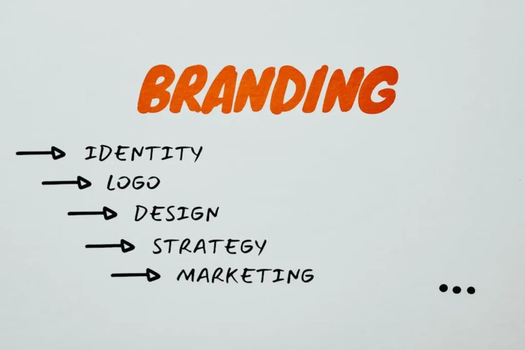
Effective portfolio branding moves beyond simply showcasing work; it articulates a distinct professional identity, communicates a unique value proposition, and.
Effective portfolio branding moves beyond simply showcasing work; it articulates a distinct professional identity, communicates a unique value proposition, and cultivates a memorable experience for potential clients or employers. A well-branded portfolio acts as a strategic asset, differentiating you in competitive markets by establishing a clear personality, expertise, and aesthetic. It’s about creating a cohesive narrative that resonates with your target audience, demonstrating not just what you do, but who you are as a creative or professional entity.
This approach transforms a collection of projects into a compelling story, guiding the viewer through your capabilities and style with purpose. The goal is to leave an indelible impression that aligns with your professional aspirations and attracts the right opportunities. Understanding how leading professionals and agencies achieve this distinctiveness provides a framework for developing your own impactful portfolio brand.
Crafting a portfolio brand involves more than selecting a template or arranging projects chronologically. It requires intentional decisions about your professional identity, target audience, and unique selling points. Consider these foundational elements:
Jessica Hische's portfolio branding is a masterclass in establishing a distinctive artistic voice through consistent visual identity and a clear focus on her specialized craft: lettering and illustration. Her site immediately immerses visitors in her whimsical, detailed, and often custom-typographic world. The branding communicates a playful yet highly professional approach, emphasizing bespoke craftsmanship and a unique aesthetic that has become instantly recognizable. Every element, from her "Daily Drop Cap" project to her client work, reinforces her signature style, making her an authority in her niche.
Best for: Illustrators, lettering artists, and designers who want to build a strong personal brand around a specific, highly refined artistic style.
Pros: Consistent visual language across all touchpoints; clear articulation of a unique artistic style; strong personal brand narrative; memorable aesthetic that fosters immediate recognition; demonstrates depth of expertise within a niche.
Cons: Highly specialized style may limit appeal to clients seeking broader design services; requires continuous artistic output to maintain relevance and showcase evolving skills; branding is deeply tied to a singular artistic vision, which can be challenging to scale or diversify.
Verdict: Jessica Hische's portfolio exemplifies how deep specialization and unwavering visual consistency can forge an iconic personal brand, attracting clients specifically seeking her unique artistic contribution rather than general design services.
Tobias van Schneider’s portfolio branding projects an image of minimalist sophistication and strategic design thinking. His site is clean, direct, and focuses on showcasing impactful projects with concise explanations. The branding emphasizes a methodical approach to design, often highlighting the problem-solving aspect and the business impact of his work. His personal brand extends beyond design projects to include his entrepreneurial ventures and thought leadership, positioning him as a multi-faceted creative strategist. The aesthetic is understated, allowing the quality and context of the work to speak volumes, reinforcing a brand built on clarity and effectiveness.
Best for: Product designers, strategists, and creative entrepreneurs who want to convey a sophisticated, minimalist, and results-oriented professional brand.
Pros: Clean, uncluttered design that prioritizes content; strong emphasis on process and impact, not just aesthetics; positions the individual as a thought leader and entrepreneur; effective use of personal storytelling to build connection; adaptable to showcase diverse professional activities.
Cons: Minimalist approach might be perceived as less "creative" by some clients seeking highly visual or experimental styles; requires strong project narratives to maintain engagement; less emphasis on a distinct visual "artistic" style, relying more on strategic depth.
Verdict: Tobias van Schneider's portfolio branding demonstrates how a stripped-down, strategic presentation can effectively communicate high-level design thinking and entrepreneurial acumen, appealing to clients who value impact and clarity over visual exuberance.
Linn Fritz's portfolio branding is characterized by vibrant, playful animation and illustration, creating an immediate sense of energy and modern appeal. Her site uses bold colors, dynamic motion, and a clear, friendly tone to reflect her specialization in character animation and motion graphics. The branding communicates a youthful, energetic, and highly skilled approach to visual storytelling, making her work instantly engaging. Her portfolio effectively uses video and interactive elements to demonstrate her core competencies, reinforcing a brand that is both approachable and technically proficient in animation.
Best for: Animators, motion graphic designers, and illustrators who specialize in dynamic, character-driven work and want to convey a modern, playful, and energetic brand.
Pros: Highly engaging and visually dynamic content; clear specialization in animation and motion graphics; strong use of color and character design to create a memorable aesthetic; communicates a modern and fresh approach; immediately showcases core skills through motion.
Cons: Reliance on motion content can impact load times if not optimized; specific style might not appeal to clients seeking more traditional or corporate aesthetics; requires continuous production of high-quality animated content to keep the portfolio fresh.
Verdict: Linn Fritz's portfolio branding excels by leveraging the inherent dynamism of her craft, creating an energetic and memorable brand that clearly positions her as a leader in contemporary animation and character design.
The branding of Sagmeister & Walsh (now &Walsh) was synonymous with bold, experimental, and often provocative design. Their portfolio was never just a showcase of work; it was an extension of their rebellious and highly conceptual design philosophy. The branding communicated a fearless approach to creativity, pushing boundaries and challenging conventions. Their site often featured unconventional navigation, striking imagery, and a direct, confident tone. This brand identity attracted clients who sought truly innovative and memorable design solutions, willing to embrace risk for impact. The portfolio was a statement piece in itself, reflecting their commitment to unique design experiences.
Best for: Design agencies and individual designers who aim to be recognized for avant-garde, conceptual, and boundary-pushing creative work, attracting clients seeking disruptive solutions.
Pros: Extremely memorable and distinctive brand identity; attracts high-profile clients seeking innovative and bold solutions; demonstrates a clear philosophical stance on design; portfolio itself serves as a testament to their creative capabilities; strong visual impact.
Cons: Potentially polarizing aesthetic might deter more conservative clients; requires a high level of creative output and risk-taking to maintain brand reputation; unconventional approaches can sometimes hinder immediate clarity for new visitors.
Verdict: Sagmeister & Walsh's branding demonstrated that a portfolio can be a powerful extension of a design philosophy, attracting a specific type of client by fearlessly showcasing a distinct, experimental, and highly impactful creative approach.
Malika Favre's portfolio branding is instantly recognizable for its minimalist, geometric, and often optical art-inspired illustrations. Her brand identity is built on precision, bold color palettes, and a sophisticated, graphic aesthetic. The site is clean and allows her distinctive illustrations to take center stage, communicating a refined artistic vision. Her branding emphasizes elegance and a unique ability to convey complex ideas with striking simplicity. This consistency across all projects and her online presence has established her as a master of her specific, highly stylized craft, attracting premium clients seeking her iconic visual language. Her branding emphasizes elegance and a unique ability to convey complex ideas with striking simplicity, showcasing strong visual storytelling.
Best for: Illustrators and graphic designers with a highly developed, distinctive artistic style who want to brand themselves as specialists in that particular aesthetic.
Pros: Extremely strong and recognizable visual identity; communicates sophistication and precision; effective use of negative space and bold color; attracts clients specifically seeking her unique style; portfolio acts as a cohesive gallery of her distinct art.
Cons: Highly specific style may limit broader appeal; requires consistent adherence to a defined aesthetic, potentially limiting exploration of other styles; less emphasis on process or client collaboration, focusing primarily on final output.
Verdict: Malika Favre's portfolio branding proves the power of unwavering commitment to a singular, highly refined artistic style, effectively positioning her as a specialist whose work is instantly identifiable and highly sought after for its distinctive elegance.
Frank Chimero's portfolio branding extends beyond visual design to encompass his philosophical approach to creativity, writing, and teaching. His brand communicates thoughtfulness, intellectual curiosity, and a deep understanding of design principles. His website is understated, focusing on clear communication and the articulation of ideas through both his design work and his extensive writing. The branding positions him not just as a designer, but as a design thinker and author, attracting clients and collaborators who value strategic insight and a reflective process. His portfolio is a testament to the power of a brand built on intellectual depth and a clear point of view.
Best for: Designers, writers, and strategists who want to build a brand around thought leadership, intellectual rigor, and a holistic approach to creative problem-solving.
Pros: Positions the individual as a thought leader and educator; strong emphasis on process, philosophy, and writing; attracts clients seeking strategic and conceptual depth; creates a sense of trust and authority through intellectual engagement; adaptable to showcase diverse creative outputs.
Cons: Less emphasis on flashy visuals, which might not appeal to clients seeking purely aesthetic solutions; requires consistent output of written content and intellectual contributions to maintain brand; can be perceived as overly academic by some audiences.
Verdict: Frank Chimero's portfolio branding demonstrates that a strong brand can be built on intellectual depth and a clear philosophical stance, attracting an audience that values strategic thinking and a thoughtful approach to design and communication.
Pentagram's portfolio branding, as a collective of independent designers, is unique in its emphasis on individual partner identities while maintaining a cohesive reputation for excellence and strategic impact. Their site showcases a vast range of high-profile projects, each attributed to a specific partner, yet unified by a commitment to rigorous design thinking. The branding communicates authority, experience, and a diverse range of expertise within a single, globally recognized entity. It positions them as a go-to for complex, high-stakes design challenges, leveraging the collective brilliance of their partners while ensuring a consistent standard of quality and innovation.
Best for: Large design agencies or collectives seeking to brand themselves as leaders in strategic design, showcasing diverse expertise under a unified umbrella of excellence and reputation.
Pros: Strong global brand recognition and reputation; showcases a vast and diverse portfolio of high-impact work; effectively balances individual creative voices with a collective identity; communicates authority and experience in complex design challenges; attracts large-scale, prestigious clients.
Cons: Maintaining brand consistency across multiple partners can be complex; the sheer volume of work might overwhelm some visitors; less emphasis on a singular, overarching visual style, relying more on reputation and strategic depth.
Verdict: Pentagram’s portfolio branding illustrates how a collective of renowned designers can build a powerful brand around shared values of excellence and strategic impact, leveraging individual brilliance to reinforce a formidable institutional reputation.
Erik Spiekermann’s portfolio branding is deeply rooted in his legacy as a typographer and information designer. His brand communicates a profound respect for legibility, structure, and the craft of typography. His website is functional, text-heavy, and direct, reflecting his no-nonsense approach to design. The branding positions him as an elder statesman of design, an authority whose work is characterized by clarity, precision, and a deep historical understanding of type. His portfolio is less about flashy visuals and more about the enduring impact and intellectual rigor behind his contributions to typography and brand identity. It's a brand built on expertise, authenticity, and a clear, strong voice.
Best for: Established professionals in typography, information design, or brand identity who want to convey authority, deep expertise, and a commitment to foundational design principles.
Pros: Establishes strong authority and legacy in a specific field; communicates deep expertise and intellectual rigor; direct and functional design reflects a no-nonsense approach; attracts clients seeking foundational and timeless design solutions; strong personal voice and perspective.
Cons: Less visually oriented, which might not appeal to clients seeking highly aesthetic or trendy designs; relies heavily on reputation and written content to convey value; the design aesthetic might be perceived as traditional rather than cutting-edge.
Verdict: Erik Spiekermann’s portfolio branding demonstrates that a powerful brand can be built on a foundation of deep expertise, historical knowledge, and a commitment to core principles, appealing to those who value clarity and lasting impact over fleeting trends.
Koto's portfolio branding emphasizes a modern, strategic approach to brand identity and digital product design. Their site is sleek, dynamic, and showcases a diverse range of contemporary brands they've helped shape. The branding communicates agility, forward-thinking design, and a strong understanding of how brands live in the digital space. They use compelling case studies that explain their process and the impact of their work, positioning them as partners who deliver tangible business value through design. Their visual identity is clean, confident, and reflective of the innovative brands they work with, reinforcing their expertise in crafting relevant and impactful brand experiences for the modern era.
Best for: Brand agencies and design studios specializing in contemporary brand identity, digital product design, and strategic branding for tech-forward or modern businesses.
Pros: Showcases a strong understanding of modern branding and digital design; compelling case studies highlight process and business impact; clean, dynamic visual identity reflects contemporary design trends; positions them as strategic partners; attracts clients seeking innovative and relevant brand solutions.
Cons: The contemporary aesthetic might evolve quickly, requiring frequent updates to stay current; less emphasis on traditional craft or artistic expression, focusing more on strategic outcomes; the agency model might feel less personal than individual portfolios.
Verdict: Koto's portfolio branding effectively communicates their expertise in modern brand strategy and digital design, leveraging compelling case studies and a sleek aesthetic to attract clients seeking forward-thinking and impactful brand solutions for the digital age.
Debbie Millman's portfolio branding is a testament to the power of storytelling, thought leadership, and multi-faceted creative contributions. Her brand extends beyond her design work to encompass her writing, podcasting ("Design Matters"), and academic roles. Her website acts as a hub for her diverse activities, communicating a brand built on intellectual curiosity, critical thinking, and a deep engagement with the design industry. The branding positions her as an influential voice, a mentor, and a cultural commentator, attracting a wide audience interested in the intersection of design, culture, and business. Her portfolio is a masterclass in leveraging diverse content to build a powerful and authoritative personal brand.
Best for: Creative professionals, educators, and thought leaders who want to build a personal brand around a diverse range of contributions including design, writing, speaking, and media.
Pros: Establishes strong authority and influence across multiple domains; leverages diverse content formats (podcast, writing, design) to engage a broad audience; positions the individual as a thought leader and cultural commentator; creates a highly personal and authentic brand connection; adaptable to showcase evolving professional interests.
Cons: Requires significant effort to maintain multiple content streams and public appearances; less focused on a singular design style, which might not appeal to clients seeking a specific aesthetic; the breadth of content could potentially dilute a specific "design" focus for some visitors.
Verdict: Debbie Millman's portfolio branding exemplifies how a personal brand can transcend traditional design work, building immense influence and authority through consistent thought leadership and a diverse, engaging content ecosystem.
Luke Choice, operating under the alias Velvet Spectrum, has built a portfolio brand around vibrant, abstract, and often surreal 3D illustration and animation. His branding is characterized by bold color gradients, dynamic compositions, and a distinct, futuristic aesthetic. His website is a visual feast, immediately showcasing his unique style and technical prowess in creating immersive digital art. The branding communicates a playful yet highly skilled approach to visual communication, positioning him as a specialist in crafting eye-catching, contemporary digital experiences. His work is instantly recognizable, attracting clients who desire a modern, energetic, and visually striking aesthetic for their campaigns.
Best for: 3D artists, animators, and digital illustrators who want to brand themselves with a highly distinctive, vibrant, and contemporary visual style, specializing in abstract or surreal digital art.
Pros: Extremely strong and memorable visual identity; showcases high technical skill in 3D art and animation; vibrant and engaging aesthetic; attracts clients seeking cutting-edge digital visuals; portfolio acts as a cohesive gallery of a unique artistic vision.
Cons: Highly specific style may limit appeal to clients seeking more traditional or corporate aesthetics; requires continuous innovation and technical skill development to maintain relevance; less emphasis on process or client collaboration, focusing primarily on the striking final output.
Verdict: Luke Choice’s (Velvet Spectrum) portfolio branding demonstrates the power of cultivating a unique, visually striking digital art style, creating an instantly recognizable brand that stands out in the contemporary landscape of 3D illustration and animation.
Anton & Irene’s portfolio branding communicates a playful yet sophisticated approach to interactive design and digital experiences. Their website is a highly interactive and engaging experience in itself, reflecting their expertise in creating innovative digital products. The branding emphasizes collaboration, creativity, and a user-centric design philosophy. They use detailed case studies that articulate their process, the challenges they faced, and the solutions they developed, positioning them as partners who deliver thoughtful and impactful digital solutions. Their brand identity is fresh, modern, and conveys a sense of approachable expertise, attracting clients who value unique and engaging digital interactions.
Best for: Digital agencies and interactive designers specializing in cutting-edge web design, interactive experiences, and digital product development, aiming for a playful yet sophisticated brand.
Pros: Portfolio itself is an example of their interactive design expertise; strong emphasis on user experience and engaging digital solutions; detailed case studies highlight process and client collaboration; communicates a modern, fresh, and approachable brand identity; attracts clients seeking innovative and experiential digital products.
Cons: Highly interactive elements can sometimes be resource-intensive or present accessibility challenges if not meticulously implemented; their specific aesthetic might not appeal to clients seeking very traditional or corporate digital solutions; requires continuous innovation in web technologies to maintain cutting-edge status.
Verdict: Anton & Irene's portfolio branding effectively leverages their own website as a demonstration of their interactive design prowess, establishing a brand that is both playful and highly sophisticated in delivering engaging digital experiences.
A well-branded portfolio isn't static; its effectiveness should be continuously evaluated and refined. Measuring success involves more than just traffic numbers. Consider these metrics and approaches:
Q: How often should I update my portfolio?
A: Your portfolio should be a living document, updated regularly. Aim for at least quarterly reviews to add new projects, refine existing case studies, and ensure your branding remains current and reflective of your best work and evolving skills. Remove outdated or less relevant projects to maintain focus.
Q: Should my portfolio have a personal brand or a business brand?
A: This depends on your professional goals. A personal brand (e.g., "Jane Doe Design") emphasizes your individual style and expertise, ideal for freelancers or solo practitioners. A business brand (e.g., "Creative Solutions Agency") suggests a team, broader services, and scalability. Some professionals successfully blend both, using their personal name as the business name.
Q: What if I have multiple niches or diverse skills?
A: If your niches are related (e.g., UI/UX design), you can integrate them into a cohesive narrative, perhaps with distinct sections. If they are disparate (e.g., web design and fine art painting), consider creating separate, highly focused portfolios for each, or a single portfolio with a very clear, high
Be the first to mark this page