Walk through any cinema lobby between roughly 1995 and 2010 and you would have seen the same typeface again and again. Gladiator. Titanic. Lord of the Rings. Pearl Harbor. The Patriot. I Am Legend. Different studios, different decades of story, different genres — same letterforms. They were all set in Trajan, a typeface released by Adobe in 1989, drawn by a designer named Carol Twombly, based on letters carved into a column in Rome in the year 113.
How does that happen? How does a digital revival of a two-thousand-year-old victory inscription become the default voice of contemporary cinema? The story is a useful one because it shows how typefaces get cast in roles they never asked for — and how, once they're cast, it can take a generation for the role to wear off.
Where Trajan came from
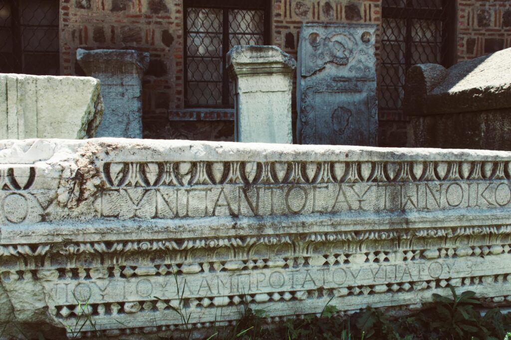
The original is the inscription at the base of Trajan's Column in Rome — Roman square capitals carved in 113 AD to mark the emperor's victories in Dacia. Typographers and lettering artists have spent two thousand years arguing that those letters are the most beautifully proportioned capital forms ever made. They are wide where they need to be wide (M, W), narrow where they need to be narrow (E, F), and the stroke contrast — the thick verticals against thin horizontals — comes from being painted on the stone with a flat brush before being chiseled.
By the late 1980s, every type designer with a classical bent had done their version. Adobe wanted one in their library. Carol Twombly drew it. The release in 1989 was clean, exacting, and limited to capitals only — because the inscription had no lowercase. The Romans didn't use lowercase the way we mean it.
Why movies adopted it
Trajan didn't get on movie posters because designers loved Roman history. It got there because of three perfectly mundane forces stacking on top of each other.
One: it shipped with everything. Trajan was bundled into early Adobe font packs. By the mid-1990s, every design studio in Los Angeles had it on every machine. Free typefaces tend to win over expensive ones, even when the expensive one is better suited.
Two: it had no lowercase. Movie titles are often short and need to be read at a distance — that's the whole brief. A capitals-only typeface forces you into the all-caps display setting that titles already wanted. You couldn't use it badly because you couldn't use it any other way.
Three: an early hit set the template. The exact moment of inflection is debated, but the title sequence and key art for Titanic (1997) used Trajan, and so did Saving Private Ryan (1998). Once two prestige films set in different periods both reached for it, the cultural meaning of the typeface drifted from "ancient Rome" toward "this is a serious picture." Once the meaning drifts, the next twenty designers reach for it for the same reason.
What Trajan started signalling
By the early 2000s, you could read Trajan on a poster and know, without seeing the image, what kind of movie it was selling. Sweeping. Earnest. Period-agnostic. It was the typeface of films that wanted to feel important. Romance, war, biblical epic, historical drama, awards-bait — all of it spoke in the same Twombly voice.
This is one of the most useful things to understand about typefaces in branding: they accumulate meaning by use, not by design. Trajan in 1989 was a quiet, scholarly revival. Trajan in 2005 was Hollywood self-importance. The forms didn't change. The audience's experience of them did.
The trap of the obvious choice
By 2008 or so, designers were openly making fun of Trajan posters. There's a famous talk by Cameron Moll where he just shows Trajan poster after Trajan poster and the audience laughs harder each time. The typeface had become so legible as a signal that it overrode whatever the actual film was about.
This is the cost of letting your typeface do too much of the work. If your audience can name the typeface and the genre cliché before they read the title, you've lost. The typeface is supposed to carry the voice in the background, not announce itself.
What replaced it
The post-Trajan era of movie posters has been more eclectic, partly because designers got self-conscious about it. You see more custom lettering (Wes Anderson's films, anything from A24). You see more display sans serifs played at extreme weights (Christopher Nolan's late period — Tenet, Oppenheimer). You see more brutally simple geometric sans (any Marvel film, basically). The replacement isn't one typeface. It's a refusal to commit to one.
What's interesting is that the replacements all carry their own freight. A bold geometric sans signals "contemporary blockbuster." Custom lettering signals "auteur." A condensed grotesk signals "thriller." The genre-coding of typefaces didn't go away — it just got harder to spot, because the vocabulary expanded.
The lesson for brand work
Trajan is the cautionary tale every brand designer should know.
You don't choose the typeface in a vacuum. You choose it into the cultural memory the audience already has. If a typeface has spent twenty years on prestige movie posters, it doesn't matter what you put it on — it will read as prestige movie poster. If it's spent twenty years on indie record sleeves, it'll carry that. The neutral typeface is a myth. The most you can hope for is a typeface whose accumulated meaning aligns with what you actually want to say.
Carol Twombly drew a careful, scholarly revival of Roman capitals. Hollywood made it the sound of every movie that wanted to feel like a Sunday newspaper review of itself. Neither party did anything wrong. But the lesson stands: the typeface you pick brings its history with it whether you wanted that history or not.
The next time you find yourself reaching for the obvious typeface for the obvious reason — Helvetica because it's neutral, Garamond because it's literary, Trajan because it's epic — pause. The reason it's obvious is that thousands of other people reached for it for the same reason first. You're not making a choice. You're inheriting one.

Be the first to mark this page