Typography Basics for Better Visual Design
Mastering typography basics enhances visual design, improves readability, strengthens brand identity, and directly impacts user engagement and conversion rates.

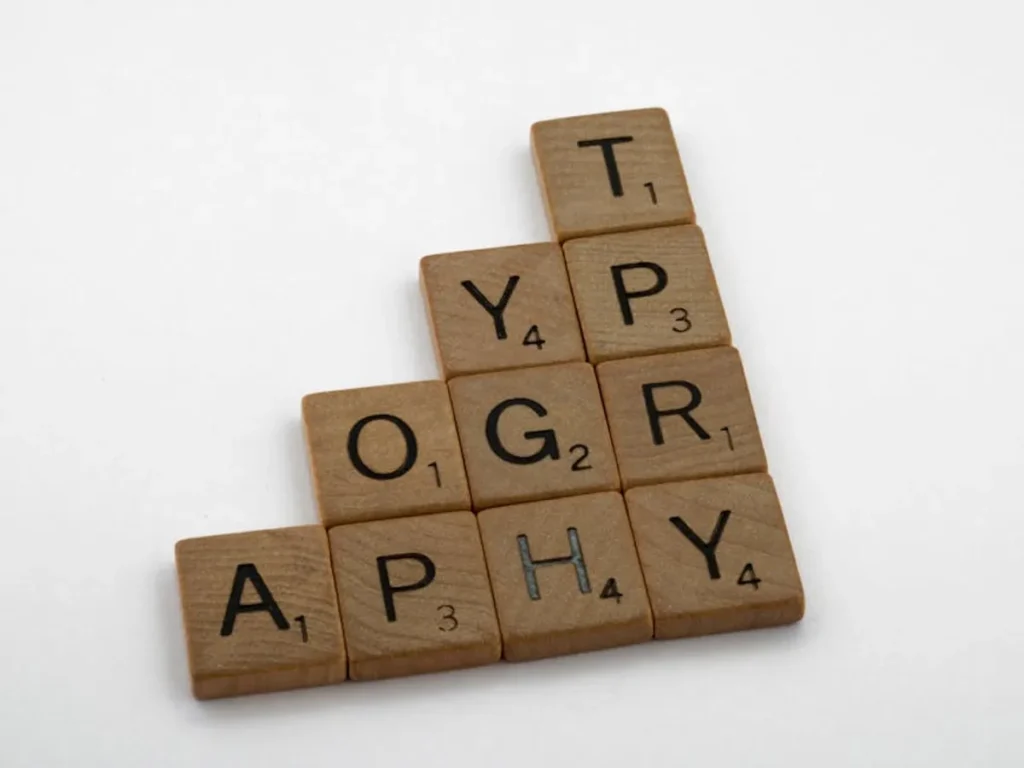
Mastering typography basics enhances visual design, improves readability, strengthens brand identity, and directly impacts user engagement and conversion rates.
Effective typography extends beyond aesthetic preference; it is a fundamental component of visual design that directly influences user experience, brand perception, and ultimately, commercial outcomes. By mastering basic typographic principles, designers and marketers can enhance readability, establish clear information hierarchy, and communicate brand values with precision, leading to higher engagement and improved conversion rates. This requires a deliberate approach to selecting, pairing, and applying typefaces, ensuring every textual element serves a functional and commercial purpose.
Typefaces are broadly categorized by their structural characteristics, each carrying distinct historical associations and psychological impacts. Understanding these categories is crucial for selecting appropriate fonts that align with a project's objectives and target audience.
Serif typefaces are distinguished by the small decorative strokes, or "serifs," attached to the ends of their letterforms. These typefaces often convey a sense of tradition, authority, and reliability. Their classic appearance makes them suitable for formal documents, print publications, and brands aiming for an established, trustworthy image. The serifs are believed to guide the eye along the baseline, aiding readability in continuous text blocks, particularly in print.
Common applications: Books, newspapers, academic journals, luxury branding, legal documents.
Sans-serif typefaces lack the decorative strokes of serifs, presenting clean, unadorned letterforms. This simplicity often communicates modernity, clarity, and approachability. Their legibility on digital screens, where resolution can sometimes blur fine details, makes them a preferred choice for web content, user interfaces, and contemporary branding. They are perceived as more direct and minimalist.
Common applications: Websites, mobile apps, corporate branding, signage, technical manuals.
Display typefaces are designed for impact at large sizes, such as headlines, logos, or posters. They often feature unique, expressive characteristics that make them unsuitable for body text due to potential readability issues at smaller scales. Their primary function is to capture attention and convey a specific mood or brand personality, making them powerful tools for visual branding and marketing campaigns.
Common applications: Advertising headlines, branding elements, book covers, event promotions.
Script typefaces emulate handwritten calligraphy, ranging from elegant and formal to playful and casual. They are inherently decorative and evoke a sense of personal touch, sophistication, or artistic flair. Due to their intricate nature and connected letterforms, script fonts are generally reserved for limited use, such as invitations, signatures, or specific branding accents, where readability is secondary to visual impression.
Common applications: Wedding invitations, product packaging, personal branding, decorative headers.
Beyond typeface selection, the application of core typographic principles dictates how effectively information is consumed and understood. These principles ensure text is not only legible but also easy to read and navigate.
Legibility refers to how easily individual characters can be distinguished from one another. A highly legible typeface has clear, unambiguous letterforms. Readability, conversely, concerns how easily entire blocks of text can be read and understood. This is influenced by factors like font size, line height, line length, and contrast. A typeface can be legible but poorly readable if not applied correctly.
Font size dictates the visual prominence of text. For body copy on the web, 16px to 18px is a common and comfortable starting point, adjusting for specific typefaces and target audiences. Line height (or leading in print terminology) is the vertical space between lines of text. Adequate line height prevents lines from merging visually, improving reading flow. A general guideline for optimal line height is 1.4 to 1.8 times the font size for body text, providing sufficient white space without appearing too sparse.
The measure, or line length, significantly impacts reading comfort. Lines that are too short force the eye to jump frequently, disrupting rhythm. Lines that are too long make it difficult for the eye to track from the end of one line to the beginning of the next. An ideal line length for body text is generally between 45 to 75 characters per line (including spaces), with 60-70 characters often cited as optimal for web content.
Tracking refers to the uniform adjustment of space between all characters in a selected block of text. Increasing tracking can make text feel lighter and more open, while decreasing it can make text denser. Kerning is the specific adjustment of space between *individual* pairs of characters to improve visual balance. While tracking is often applied globally, kerning is typically used for headlines, logos, and display type where precise visual harmony is critical to avoid awkward gaps or overlaps between letters.
Visual hierarchy uses variations in size, weight (boldness), and style to guide the reader's eye and emphasize important information. Establishing a clear hierarchy ensures that headings stand out from subheadings, and key points are easily distinguishable from body text. This structured approach helps users quickly scan content and grasp the main message.
Effective typeface pairing involves combining two or three fonts that complement each other without competing for attention. The goal is to create visual interest and clear differentiation between content types (e.g., headings and body text) while maintaining a cohesive overall design.
A common strategy is to pair a serif typeface for headlines with a sans-serif for body text, or vice-versa, leveraging their inherent contrasts. Alternatively, combining two sans-serifs with distinct characteristics (e.g., one geometric, one humanist) can also be effective. The key is to seek fonts that offer enough contrast in weight, structure, or mood to serve different roles, but not so much that they clash.
Pro Tip: Limit your typeface palette to two, or at most three, distinct fonts per project. Introducing too many typefaces creates visual clutter, dilutes brand identity, and can negatively impact loading times on digital platforms. Focus on establishing clear roles for each chosen font (e.g., one for headlines, one for body text, one for accents) and explore variations in weight and style within those families before adding another typeface.
Thoughtful typography is not merely an aesthetic choice; it is a strategic investment in user experience and business objectives. Clear, readable text reduces cognitive load, allowing users to process information more efficiently. This translates directly to increased time on page, lower bounce rates, and improved comprehension of calls to action.
A consistent and well-executed typographic style reinforces brand identity, building trust and professionalism. Inconsistent or poorly chosen fonts can convey carelessness, undermining credibility. Furthermore, accessible typography, which includes sufficient contrast and scalable font sizes, ensures that content is usable by a wider audience, including those with visual impairments, thereby expanding market reach and complying with modern web standards.
To integrate these typography basics into your visual design process, begin by defining the primary purpose of your text: is it a headline needing impact, or body copy requiring sustained readability? Select typefaces that align with your brand's personality and the content's tone. Establish a clear typographic scale for headings, subheadings, and body text, ensuring consistent application across all touchpoints. Pay meticulous attention to line height and line length for optimal reading comfort, especially for longer passages. Regularly review your designs on different devices and screen sizes to confirm legibility and readability, making adjustments as necessary to maintain a superior user experience.
What is the difference between a typeface and a font?
A typeface is a family of related fonts (e.g., Helvetica), encompassing all its weights, styles, and sizes. A font is a specific variation within that typeface family (e.g., Helvetica Bold 12pt).
How many typefaces should I use on a single design?
Generally, it is best to use no more than two or three typefaces in a single design to maintain visual cohesion and avoid a cluttered appearance. Focus on using different weights and styles within a chosen typeface family to create variety.
What are some common mistakes to avoid in typography?
Common mistakes include insufficient contrast between text and background, using too many different typefaces, setting line lengths that are too long or too short, and choosing highly decorative fonts for body text that hinder readability.
Does typography affect SEO?
Indirectly, yes. Good typography improves user experience by making content more readable and engaging. A positive user experience can lead to longer time on page, lower bounce rates, and increased engagement, all of which are positive signals for search engine ranking algorithms.
Be the first to mark this page