What variable fonts are actually for
Variable fonts are not 'regular fonts but with sliders.' They're a different deliverable that lets brands respond to context without licensing a different file every time.

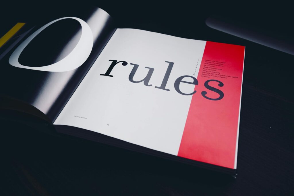
Variable fonts are not 'regular fonts but with sliders.' They're a different deliverable that lets brands respond to context without licensing a different file every time.
The first time I saw a variable font demo, I assumed it was a clever rendering trick. The same typeface, sliding smoothly between Light and Black, between Regular and Italic, all from one file. It looked like a magic show. It is not. It is a fundamentally different deliverable from the static OpenType files that most brand systems are built on, and the implications for brand work are big enough that they have not been fully absorbed yet.
Before 2016, a typical brand-identity license bought you discrete weights. You licensed Light, Regular, Medium, Bold, and Black, each as a separate font file. Each one was a separately drawn cut. The Bold was not the Regular at 700. It was a specific drawing the type designer made by hand, with proportions tuned for that weight.
The cost was real. A brand using six weights paid for six files. The web cost was real too — every weight was a separate file the browser had to download. Most websites that wanted four weights of a typeface were shipping a megabyte of font data before the user saw a single letter.
The OpenType variable spec, finalised in 2016, let foundries ship one file containing the full continuum. Instead of Light + Regular + Medium + Bold + Black, you get Recursive's wght axis from 300 to 1000, every value in between. The interpolation is mathematical but the master cuts are still hand-drawn — the type designer draws Light and Black and the variable engine fills in. Done well, every intermediate weight looks intentional.
Variable fonts can carry any number of axes. In practice, four show up over and over.
Weight (wght). This is the one everyone uses. Slide from Thin to Black on a single axis. Modern browsers respect font-weight values down to 100 and up to 1000, where the static OpenType spec topped out at 9 named weights.
Optical size (opsz). This is the most underused. Optical size lets the typeface adjust its proportions for the size it is being read at. At display sizes (40pt+) it can be tighter, more elegant, with finer details. At caption sizes (8pt-) it can be more open, sturdier, with less hairline contrast that disappears at small sizes. Newsreader is a good example of a Google Font that uses opsz well. Most brands ignore this axis and use the same drawing for headlines and footnotes. Most brands' footnotes look bad as a result.
Slant (slnt). A continuous slant axis lets you go from upright to italic — or to anywhere in between. A 5° slant is not a typeface, but it is a valid expressive choice for a one-off pull quote. Static fonts cannot offer this.
Custom axes (CASL, MONO, etc.). The OpenType spec lets foundries define their own axes. Recursive ships a CASL (casual) axis that morphs the typeface from a clean sans to a casual hand-drawn feel, and a MONO axis that morphs from proportional spacing to monospace. These exist because the foundry decided they were worth the engineering. A brand using Recursive can be playful AND technical, in the same file, by sliding two values. That is a kind of expressive range no static font can offer.
Variable fonts are a non-trivial engineering project. Drawing a single weight is hard. Drawing a continuous range of weights that all look intentional, on multiple axes, is much harder. The math has to work. The hinting has to work. The OpenType file has to be tested in browsers, in design software, in print pipelines, and in legacy environments that may or may not respect the spec.
Most independent foundries don't have the staff for that engineering. So they continue to ship static fonts and license per-weight, the way the industry has worked for thirty years. Even big foundries like Hoefler&Co have been slow. The handful of variable fonts that have shipped — Inter, Recursive, Roboto Flex, Bricolage Grotesque, Newsreader — are mostly from the open-source / Google Fonts ecosystem or from foundries with venture funding.
The brands that adopt variable fonts early are the ones whose design teams have figured out the licensing maths. A variable font is one license. A static font family is six. For a brand with global usage, that arithmetic alone justifies the move.
For brand designers, variable fonts change the question from "which weight do we use here?" to "how do the axes carry the brand's voice across contexts?" That is a richer question. It also requires more discipline.
The discipline: treat the axis values as a system, not a freedom. If your brand uses weight 700 for headlines, weight 500 for body, and weight 850 for emphasis, those values should be documented. They should be the same on every surface. The variable font does not free you from a type system; it gives you a more granular type system you have to maintain more carefully.
The brands that misuse variable fonts use them like a free-for-all. The wordmark is at one weight, the marketing site uses another, the product UI uses a third, and nobody can articulate why. The result is a brand that feels less coherent than it would have been with three static cuts and a rule.
Variable fonts are a tool. They are not a strategy. The strategy is the same as it always was: pick a voice, document it, hold the line.
Be the first to mark this page